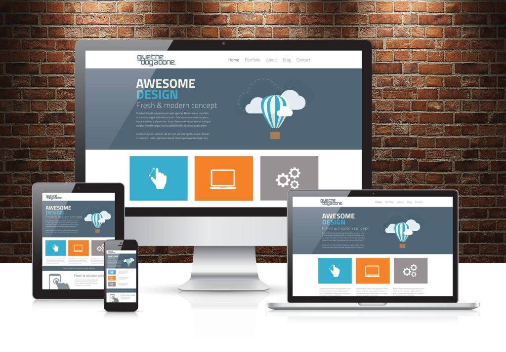
Responsive Website Design

Key Components of Responsive Website Design

1. Fluid Grids
2. Flexible Images and Media
3.Media Queries
4. Viewport Meta Tag
Benefits of Responsive Design

Improved User Experience

SEO Benefits

Cost-Effectiveness

Future-Proofing

What people say about us

Lorem Ipsum is simply dummy text of the printing and typesetting industry. Lorem Ipsum has been the industry's standard dummy text ever since the 1500s, when an unknown printer took a galley of type and scrambled it to make a type specimen book.
James Smith Web Designer
Lorem Ipsum is simply dummy text of the printing and typesetting industry. Lorem Ipsum has been the industry's standard dummy text ever since the 1500s, when an unknown printer took a galley of type and scrambled it to make a type specimen book.
James Smith Web Designer
Steps for Developing a Responsive Website
Plan for a Mobile-First Approach
Start designing for the smallest screen first and progressively enhance the design for larger screens. This approach ensures a streamlined experience on mobile and helps prioritize essential content.
Use a Responsive CSS Framework
Frameworks like Bootstrap, Foundation, or Tailwind CSS provide pre-built responsive components and grid systems, speeding up the development process.
Create a Flexible Grid Layout
Structure your layout using CSS Flexbox or CSS Grid to create a flexible, responsive layout. For example, Flexbox makes it easy to control the direction, order, and spacing of elements.
Implement Media Queries for Breakpoints
Define breakpoints (usually based on common device widths) to apply specific styling rules for different screen sizes.
Optimize Images and Media
Use srcset and sizes attributes in images to deliver different image resolutions based on the screen size. Compress images and videos to reduce load times, which is especially important on mobile.
Responsive Navigation
Design a navigation menu that’s easy to use on small screens, such as a collapsible or “hamburger” menu that expands when tapped.
Test on Real Devices and Emulators
Test your website on multiple devices and browsers to ensure consistent behavior and appearance. Tools like Chrome DevTools, BrowserStack, or Responsinator can help simulate various devices.
Optimize for Performance
Minimize CSS and JavaScript, use lazy loading for images, and leverage caching to ensure your website loads quickly on all devices.
Contact Us
and we will call you back
Call Us
xxxxxxxx
xxxxxxxxxx
Address
xxxxxxxxxxx

Lorem Ipsum is simply dummy text of the printing and typesetting industry. Lorem Ipsum has been the industry's standard dummy text ever since the 1500s, when an unknown printer took a galley of type and scrambled it to make a type specimen book.
James Smith Web Designer